Workspaces in 2026 are no longer designed around hierarchy, rigidity, or visual authority alone. They are designed around balance—between technology and humanity, stimulation and calm, performance and well-being. In this context, the Color of the Year is not a decorative afterthought; it is a strategic signal of how work itself is evolving.
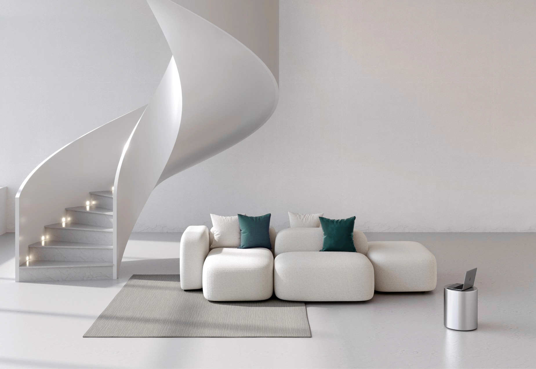
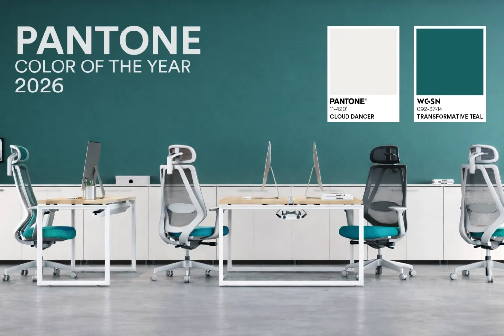
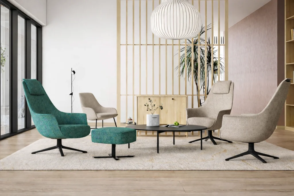
This year, two global authorities in color forecasting point clearly toward that balance. WGSN introduces Transformative Teal, a color rooted in renewal, adaptability, and fluid thinking. Meanwhile, Pantone counters depth with softness through Cloud Dancer, an airy, barely-there neutral designed to calm overstimulated environments.
Together, these two shades reflect the modern workplace reality: dynamic, collaborative, tech-enabled—yet consciously gentle.
WGSN Color of the Year 2026: Transformative Teal — Movement, Mindfulness, Momentum
Transformative Teal is not the bold, corporate teal of the past. It is more nuanced—sitting at the intersection of blue and green, logic and creativity, calm and progress. WGSN positions this color as a response to an era of constant transition, where adaptability is the most valuable workplace skill.
What Transformative Teal Represents:
- Renewal and forward motion
- Emotional clarity in fast-changing environments
- A bridge between digital sophistication and organic calm
In workspaces, this color feels intelligent rather than overpowering. It stimulates thought without causing fatigue—making it ideal for environments that demand sustained performance.
Applying Transformative Teal in Offices
Transformative Teal performs best when used with intent:
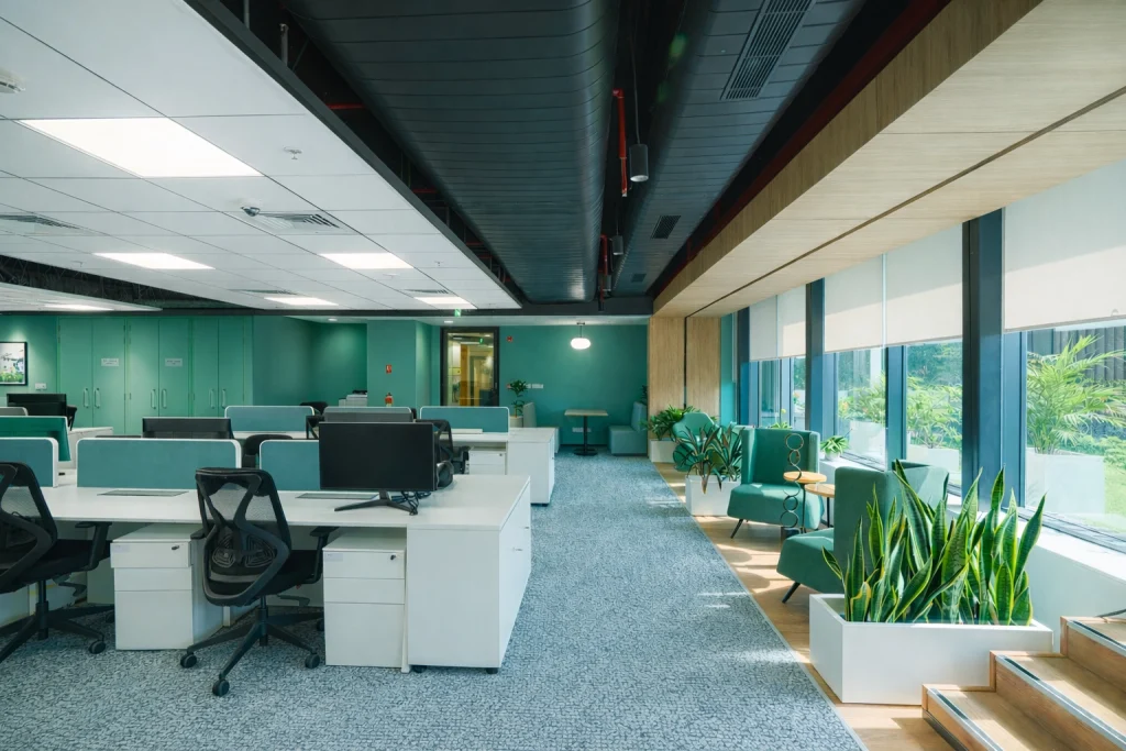
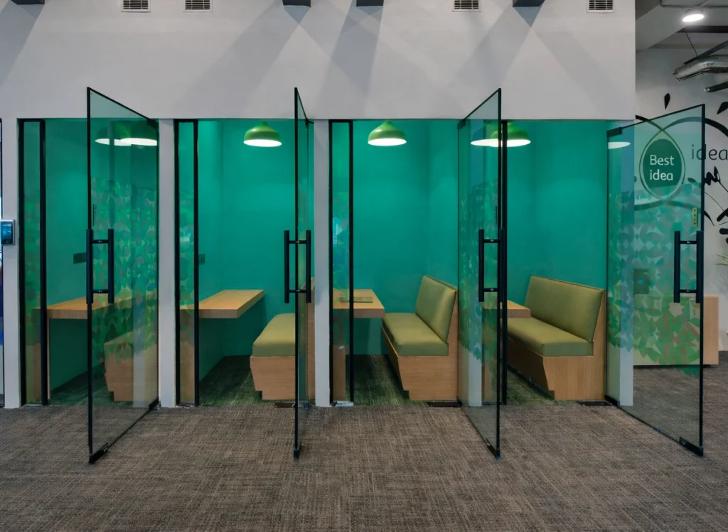
- Collaborative areas: Ideal for meeting rooms, brainstorming hubs, and co-creation spaces where innovation is central.
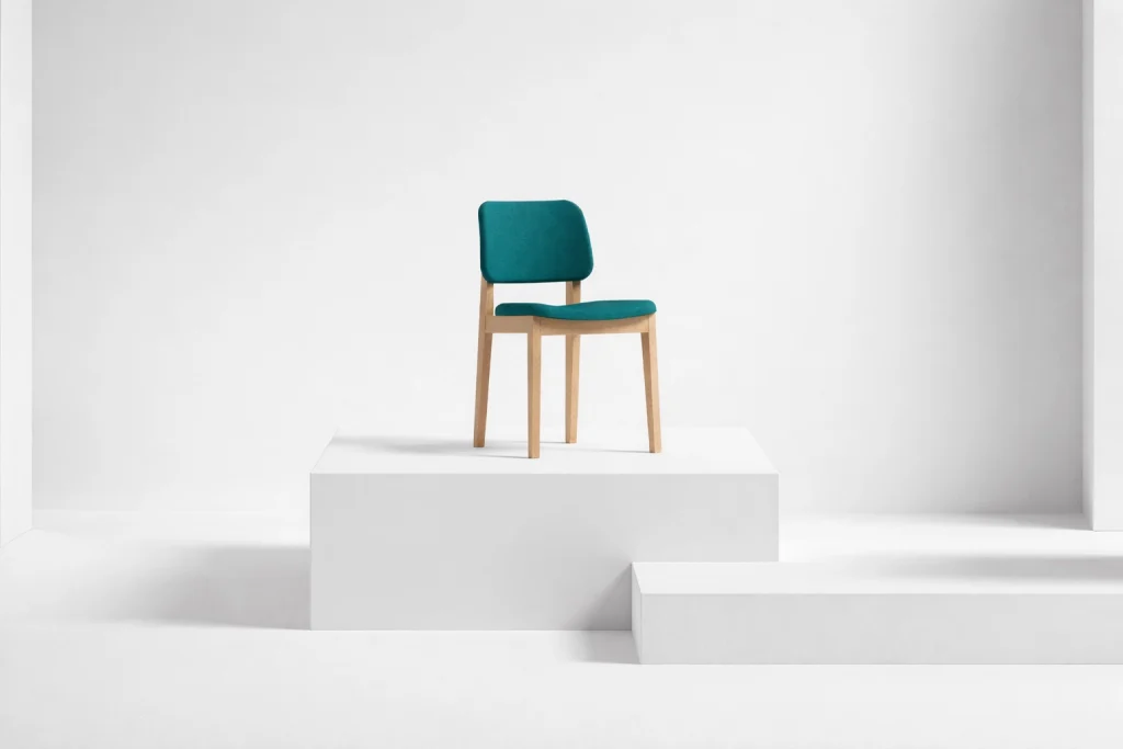
- Furniture accents: Upholstered task chairs, lounge seating, or acoustic panels in teal introduce visual energy without distraction.
- Technology-enabled zones: The color pairs naturally with screens, smart surfaces, and digital infrastructure, reinforcing a future-ready aesthetic.
When combined with warm woods, soft greys, or matte black frameworks, Transformative Teal brings depth while staying grounded.
Pantone Color of the Year 2026: Cloud Dancer — The New Neutral for Modern Work
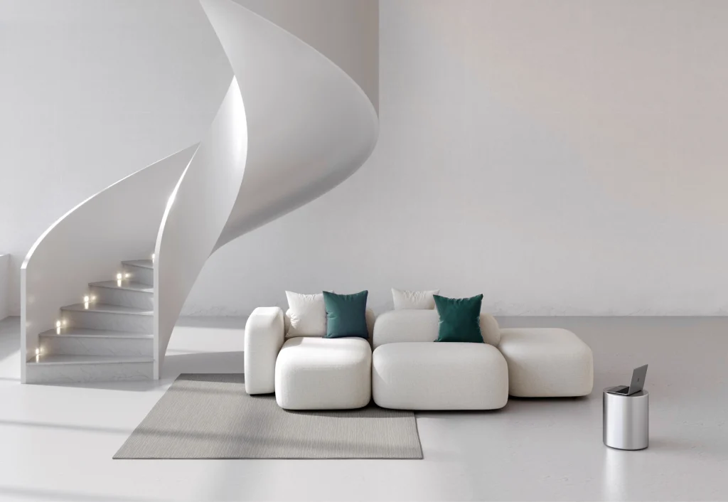
Pantone’s Cloud Dancer is a subtle, refined off-white that moves away from clinical brightness. It is designed to breathe—to reduce visual noise in spaces already overwhelmed by screens, data, and movement.
This color reflects a clear shift: offices are no longer meant to impress; they are meant to support.
What Cloud Dancer Stands For:
- Calm, clarity, and mental openness
- Visual softness without loss of sophistication
- A human-centric alternative to stark whites
In modern offices, Cloud Dancer acts as a silent enabler—allowing people, furniture, and ideas to take center stage.
Using Cloud Dancer in Workspaces
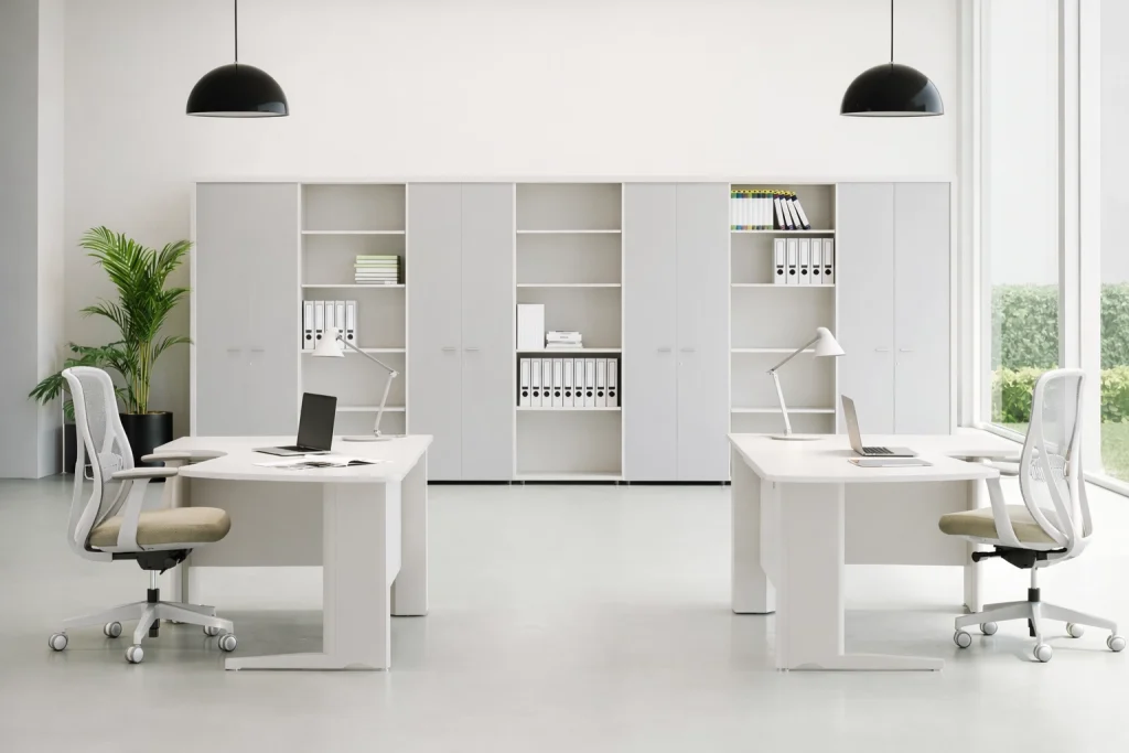
- Base color for interiors: Walls, partitions, and storage units in Cloud Dancer create light-filled, expansive environments.
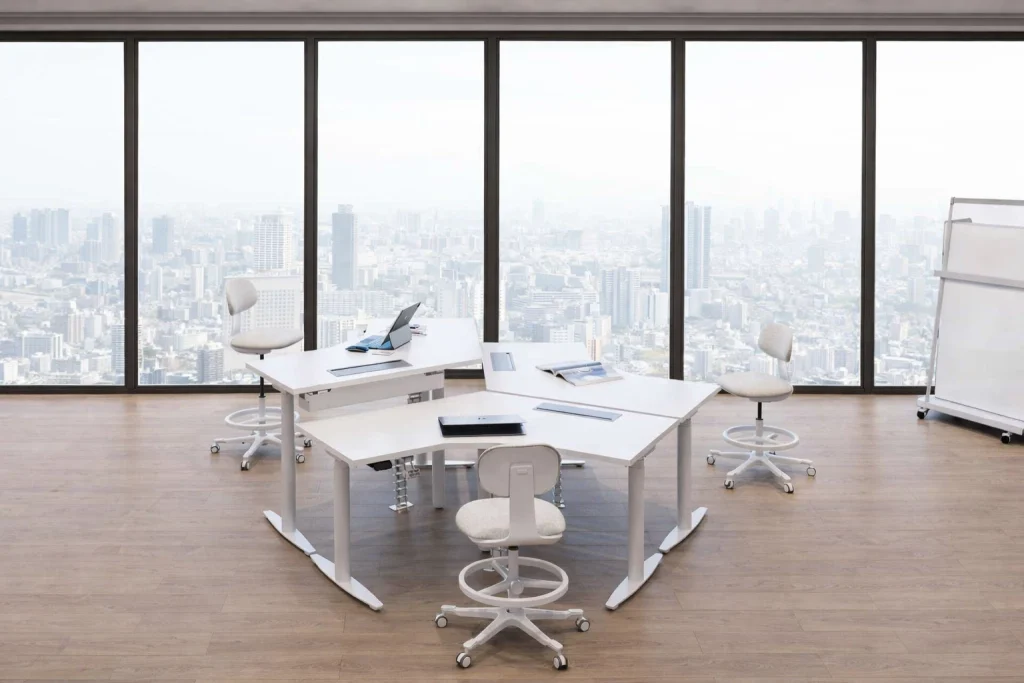
- Furniture systems: Workstations, tables, and cabinetry finished in this shade feel lighter and less visually dense.
- Hybrid spaces: Perfect for offices that shift between focused work, meetings, and social interaction throughout the day.
Its greatest strength lies in versatility—it pairs seamlessly with both bold and muted accent colors.
Transformative Teal + Cloud Dancer: A Perfect Workspace Equation
What makes 2026 especially relevant for workplace design is not just the individual colors, but how beautifully they coexist.
Together, these shades create a workspace language that mirrors how teams function today:
- Cloud Dancer sets the emotional baseline—calm, open, and uncluttered.
- Transformative Teal injects intention—focus, movement, and creative energy.
Zoning Through Color
- Use Cloud Dancer as the dominant palette for workstations, circulation areas, and storage to maintain visual ease.
- Introduce Transformative Teal in collaboration zones, seating, and feature walls to encourage engagement.
- Balance both with natural textures—wood, fabric, metal—to avoid flatness.
This approach allows organizations to design spaces that feel cohesive yet purpose-driven.
What This Means for Rockworth’s Furniture & Workspace Strategy?
At Rockworth, furniture is not designed in isolation—it is designed for ecosystems. The 2026 Colors of the Year align closely with how modern offices are being planned across India and globally.
These colors influence:
- Furniture finishes: From laminate palettes to powder-coated metal frames
- Upholstery choices: Supporting both ergonomic performance and visual calm
- Large-scale deployments: Enabling consistency across diverse office zones
Transformative Teal adds distinction to collaborative and leadership furniture, while Cloud Dancer keeps large work floors light, timeless, and adaptable to future redesigns.
For enterprises planning long-term office investments, this combination ensures longevity—both aesthetically and emotionally.
Color as Infrastructure, Not Just Decoration
In 2026, color is no longer about trends—it is about function.
- It shapes how people think
- It influences how long they stay focused
- It determines how welcoming a space feels
Transformative Teal supports momentum and innovation.
Cloud Dancer protects calm and clarity.
Together, they reflect a workplace philosophy that understands one simple truth: the best-performing spaces are the ones that feel balanced, intentional, and human.
And that, ultimately, is the future of work.